Visualizing User Journeys Using Data Science Techniques
Making sense of your user data is essential. Here are some analysis techniques on how to do that.
Written by William Huang.
Motivation
Understanding customer trends is vital to any business in today’s world. Companies like Amazon and Google strive to analyze data in order to give recommendations and use well-placed ads to generate more revenue. For Camino Financial, it is important for us to try and fully see the way users move through our website so we can better understand exactly who ends up applying for a loan and eventually closing with us.
First, we have to define some terms. A lead is an object that describes a person who is interested in closing a loan with us. For example, if a user clicked on the loan application link, a lead would be generated for that person. After being contacted by one of our team members, leads turn into opportunities. Finally, if an opportunity is finalized (closed), it becomes a loan. If the opportunity is abandoned, it becomes inactive.
We can track the way users move through the website and loan application through JavaScript cookies. Whenever a user clicks on a certain link or takes a certain action, like visiting our blog, we save their IP address and this event as a cookie and store it in our database. If we have this entire database full of valuable information on how our users behave on our website, then surely we can utilize this data, right?
Retrieving the Data
Using SQL queries and a database service called Redash, we can extract the data from the database and save it as a readable plaintext format.
Because the cookies databases and the Salesforce Opportunities database are separate, we need to connect them together through user email. The combined table is defined as the users table in the WITH statement. Then, we SELECT the event, timestamp, and associated email from the cookies database and the Opportunities database where the emails match. A simple inner join can also be used to achieve this. Finally, we filter out unnecessary event names, and ORDER BY email, then timestamp to ensure that the events are grouped chronologically by each user.
WITH salesforce AS
    (
        SELECT email, close_date
        FROM salesforce.opportunities
        WHERE stage_name = 'Closed'
    ),

    users AS
    (
        SELECT DISTINCT a.ip_address, b.email, b.close_date
        FROM javascript.identifies AS a, salesforce as b
        WHERE a.email = b.email

        UNION ALL SELECT DISTINCT a.ip_address, b.email, b.close_date
        FROM javascript.lead_form_completed AS a, salesforce AS b
        WHERE a.email = b.email

        UNION ALL SELECT DISTINCT a.ip_address, b.email, b.close_date
        FROM javascript.submit_form_prequalify AS a, salesforce AS b
        WHERE a.email = b.email
    )

SELECT e.event. e.timestamp, u.email
FROM javascript.events AS e, users AS u
WHERE e.event NOT IN ('click_link', 'change_value') AND e.ip_address = u.ip_address AND x.timestamp < y.close_date
ORDER BY email, timestamp
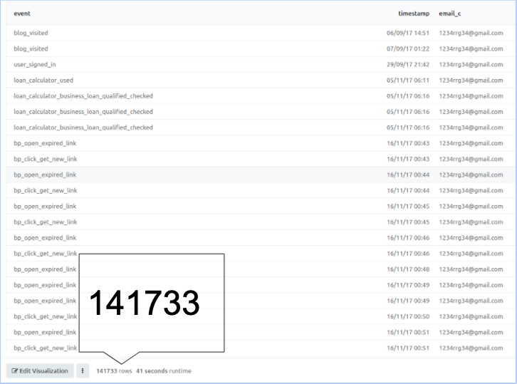
As you can see, there are over 100,000 data points that are ready to be analyzed! You can also filter the opportunities by the ones that are NOT closed, which could give a good sense of what type of user usually ends up in an inactive loan.
Probability Background
We can represent a user’s journey through our website as a discrete-time Markov chain. A Markov chain is a stochastic model describing a sequence of possible events in which the probability of each event depends only on the state attained in the previous event. In simpler terms, it is a memoryless system whose current state relies ONLY on the previous state and is probabilistically independent of the system’s states that occurred before the previous state. For example, if a user visited our home page, then visited the blog, and is now at the loan application, the probability that they now finish the loan application is only dependent on the probability that a user finishes the loan application given that they were on the loan application, denoted by P[User finishes the loan application | User is on the loan application] The fact that the user visited our home page and the blog does not factor into our calculation, thus the system is memoryless.
Visualization
Now that we have a good intuition for the analysis, let’s start working with the data. Here are the packages we will be working with.
import pandas as pd
import numpy as np
import seaborn as sns
import matplotlib as plt
import chord
We need to load the data into a Pandas dataframe so we can effectively filter and index into it.
FILENAME = './data/Aggregate_Tracks_SF_Opportunities_Closed_2019_08_20.csv'
df = pd.read_csv(FILENAME)
We can loop through each user’s events chronologically to construct a matrix counting the number of times an action j was taken given that action i was taken. First, we need to initialize the matrix. We can grab all the unique event names (actions) from our data and initialize a dataframe of all zeros that will represent our matrix.
column_names = df.event.unique()
row_names = df.event.unique()
column_names.sort()
row_names.sort()
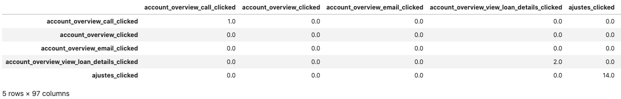
matrix = np.zeros((97,97))
transition_matrix = pd.DataFrame(matrix, columns=column_names, index=row_names)
Then, we can loop through the groups created by df.groupby
#Group data by email_c to create list of DataFrames, each DataFrame representing all the events done by one user
df_list = [group for _,group in df.groupby(['email_c'])]

#Populate transition matrix
for email_identity in df_list:
    #List of all events done by a unique email, already ordered by timestamp based on redash SQL query.
    events = list(email_identity['event'])
    for i in range(len(events) - 1):
        #Increment transition_matrix[current_event, next_event] by 1
        transition_matrix.at[events[i], events[i + 1]] = transition_matrix.at[events[i], events[i + 1]] + 1

#print out result
transition_matrix.head()
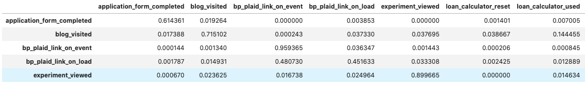
We can then normalize the rows and filter out uncommon events. We can call the normalized matrix a transition matrix that represents the probability of a user taking an action given their current state. Each entry i, j in this transition matrix represents the probability of taking action j, given that they just took action i (denoted as P[j | i]).
#Take out all events that don't have more than 2500 occurences
cleaned_matrix = transition_matrix.loc[(transition_matrix.sum(axis=1) >= 2500), (transition_matrix.sum(axis=0) >= 2500)]

#Divide each element by total sum of the entire row to create probabilities
cleaned_matrix = cleaned_matrix.div(cleaned_matrix.sum(axis=1), axis=0)
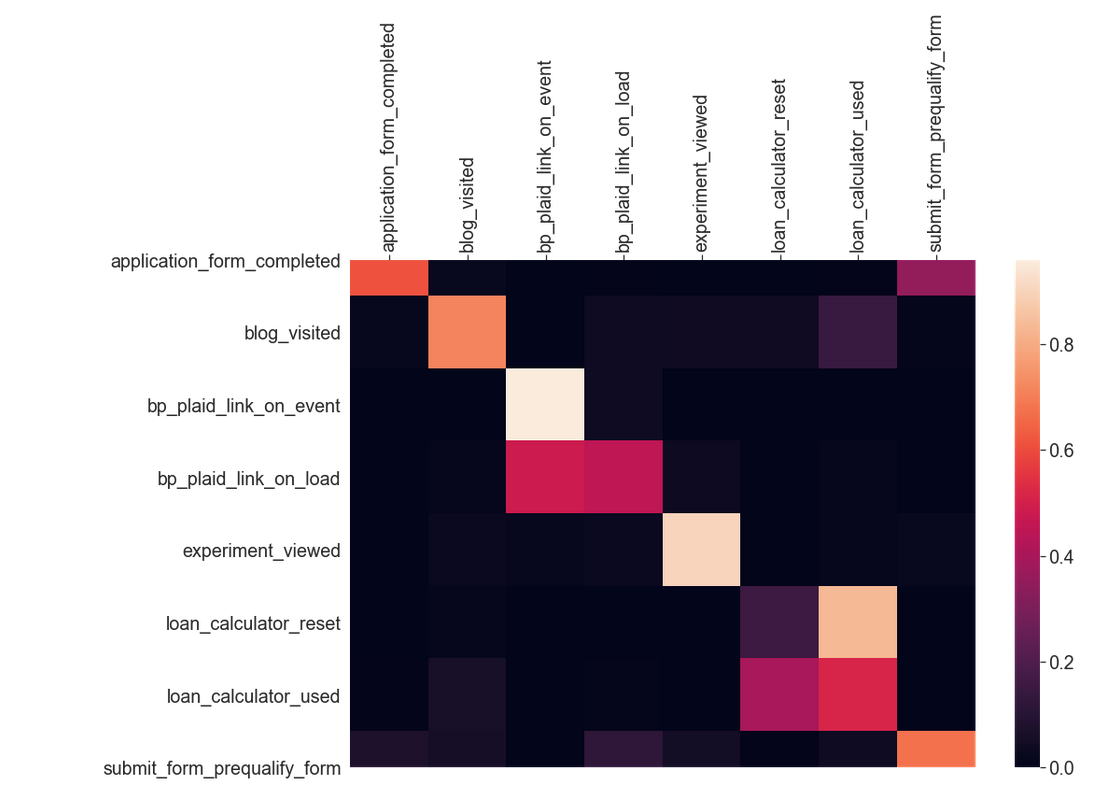
Now, let’s try and visualize the transition probabilities. We can use a Python package called Seaborn to generate a heatmap from a Pandas Dataframe. This heatmap allows us to better visualize the probability trends of user taken events.
#Set graph settings
plt.pyplot.figure(figsize = (15,10))
sns.set(font_scale=1.8)

#Generate heatmap. Documentation: https://seaborn.pydata.org/examples/heatmap_annotation.html
hm = sns.heatmap(cleaned_matrix)

#Set heatmap settings
hm.xaxis.tick_top()
hm.set_xticklabels(labels = cleaned_matrix.columns, rotation=90)

#Show heatmap
hm
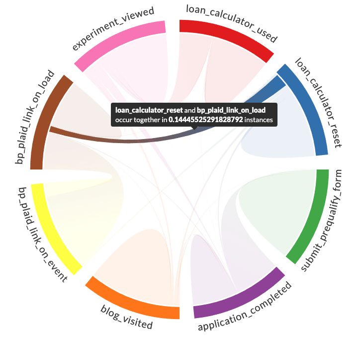
We can also better visualize the data as a chord diagram.
matrix = cleaned_matrix.values.tolist()
names = list(cleaned_matrix.columns)
chord.Chord(matrix, names, width=700, padding=0.1).show()
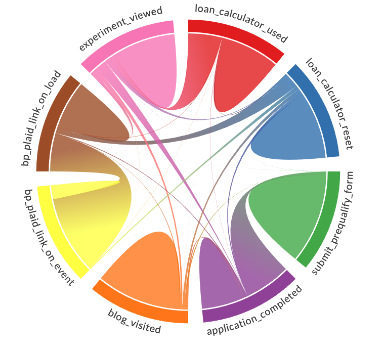
You can hover over individual arcs in the chord diagram to display statistics about that arc.
Analysis
Now that we can visualize the data better, what kind of conclusions can we draw from it? It can be seen that the heatmap is concentrated along the diagonal, indicating that many users take repeated actions. This makes sense because a user often makes multiple actions, like clicking a button, for example. Additionally, we can see that many squares are black either because it is unlikely for a user to make that transition (i.e a small button) or just flat-out impossible (i.e that button doesn’t exist on the previous action’s webpage). Using this information, we can maximize the probability that a user takes a certain action. For instance, we could increase the noticeability of a certain button we want a user to click.
Beyond this, we can calculate the hitting time of a current user, or in other words, the average number of steps it will take to reach the submit loan application event from their current state. By doing so, we could, for example, further pursue leads and reach out to the users who have a low hitting time, which indicates that the probability that they reach the submit loan application event is higher than others.
Conclusion
Although we have done lots of scraping, visualization, and analysis, we have barely scratched the surface. As for next steps, we can further analyze the implications of this Markov chain, but more data cleaning must be done first. More specifically, it would be beneficial to have more concise events, as there are currently many events which either are repetitive and thus give us repetitive information, or are too obscure to even understand what event they are. By improving the events themselves, we can better track a user’s journey through our website.